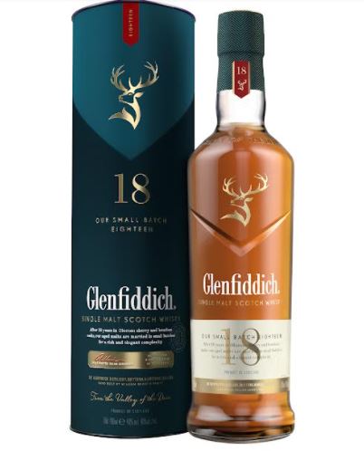
Glenfiddich, the world’s most awarded single malt scotch whisky, pays homage to its origins in the ‘Valley of the Deer‘ with a striking new package design for its 18-Year-Old iconic whisky. The new packaging has been rolled out globally, after the successful redesign of the Glenfiddich ‘Our Original Twelve’ and ‘Our Solera Fifteen’.
The bold new look of the pack celebrates the family-run heritage and combines it with a more sophisticated and elegant design. The 18-Year-Old is now known as the ‘Small Batch 18’, as a clear nod to the refined age and small batches that embody the Glenfiddich flavor range. The redesign is a distinctive new look and is intended to appeal to current alcohol drinkers as well as entice those around the world who are new to the brand and category.
Glenfiddich 18 packaging sees revised gold and blue colouring utilised throughout, plus screen printed stag details, fluted foil-die to give a raised impression and ‘Small-batch’ called out in an embossed seal and gold lozenge. Each element has been carefully designed and crafted to further elevate the aesthetics and embody the mature age of the whisky, elegance of flavor and higher RRP.
The liquid is aged in Oloroso sherry and bourbon casks for 18 years then married in small batches of only 150 casks. The age mellows and ripens the signature summer notes and the marrying intensifies the richness and elegance.
Payal Nijhawan, head marketing, William Grant and Sons, “The contemporary new outlook of our iconic Glenfiddich 18 epitomizes the brand’s irrepressible spirit. The state-of-the-art design embodies the remarkably rich taste of the single malt and reinforces speaks our commitment to experiment, innovate and explore all aspects of the spirit.”
Glenfiddich means “The Valley of The Deer”, and its location in Speyside, Scotland, is where William Grant, Glenfiddich’s visionary founder, turned his dreams into reality in 1887 by hand-building the distillery with the help of his seven sons and two daughters in a single year. In honor of the brand’s home, the new design now features this clearly defined valley, cut into the face of the glass, to give a more chiselled profile. The iconic Stag symbol, embossed in gold, also proudly sits within the V of the valley shape. William Grant’s signature is gold emblazoned on the bottle top.
The new packaging has been designed by the award-winning East London design agency HERE design.
IndiFoodBev — authentic, impactful and influential
An English-language food and beverage processing and packaging industry B2B platform in print and web, IndiFoodBev is in its third year of publication. It is said that the Indian food and beverage industries represent approximately US$ 900 billion in revenues which implies more than 20% of the country’s GDP. Eliminating the wastage on the farmside can help to deliver more protein to a higher number of the population apart from generating sizable exports. The savings in soil, seeds, water, fertilizer, energy and ultimately food and nutrition could be the most immense contribution that country is poised to make to the moderation of climate change.
To improve your marketing and grow sales to the food and beverage processing and packaging industry, talk to us. Our research and consulting company IppStar [www.ippstar.org] can assess your potential and addressable markets in light of the competition. We can discuss marketing, communication, and sales strategies for market entry and growth.
Suppliers and service providers with a strategy and budget for targeted marketing can discuss using our hybrid print, web, video, and social media channels to create brand recognition linked to market relevance. Our technical writers are ready to meet you and your customers for content.
The second largest producer of fruit and vegetables in the world is continuously expanding processing capacities and delivery systems with appropriate innovative technologies. We cover product and consumer trends, nutrition, processing, research, equipment and packaging from farm to thali. Get our 2025 media kit and recalibrate your role in this dynamic market. Enhance your visibility and relevance to existing markets and turn potential customers into conversations. Ask for a sample copy of our bi-monthly in print or our weekly IndiFoodBev eZine each Wednesday.
For editorial info@ippgroup.in — for advertisement ads1@ippgroup.in and for subscriptions subscription@ippgroup.in
Naresh Khanna – 10 February 2025
Subscribe Now


